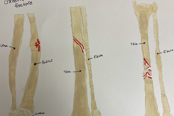
It’s interesting to see all of these different types of fractures lined up together like this. Its a lot easier to grasp the the effects of these fractures in a presentation such as this, or at least its easier to visualize the immediate physical impact of such injuries.
The abstracts themselves don’t communicate much beyond what the local area of the fracture looks like and what I assume to be a flooding of blood to the affected area. With that being said the phase “A picture is worth a thousand words” is applicable here. Though context absolutely helps when looking at an abstract meant to communicate information or a lesson such as this. Without it all someone can really tell from this is what a fracture of these six varieties may look like. Without context the observer doesn’t know anything about other immediate effects of what they’re looking at.
In terms of presentation this is really good. The leg and arm bones are very well drawn, and the different colors makes this much more visually pleasing to look at. The use of only a few colors plays very well to the strength of the abstracts. The use of only a few colors makes it so much more easier to visualize the direct impacts of the fractures. Overall I really like this piece.
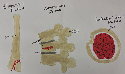