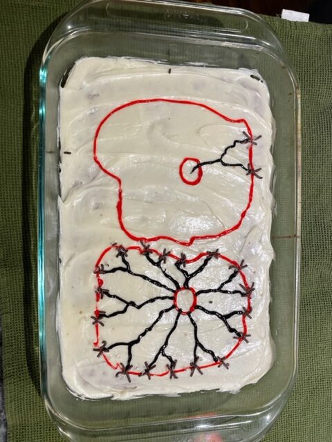
I think its very cool that you baked a cake for this project, especially using icing to illustrate the two cells. The contrast between the colors is very well done as the red cell outlines contrast greatly against the white background, but still let the black icing depictions of the chromosomes and the connections stay clear. The red was a good choice as it doesn’t contrast as much as the black, giving it more layers of depth and achieving a good range of value. Its depiction of how cancer cells can grow to have an abnormal amount of chromosomes in comparison to the healthy cell. I do appreciate the simplification of the cell as it makes the chromosome abundance difference very clear and easy to understand. The non perfect shape of the cells also creates a more realistic appearance as the cell becomes squished against each other.
As the cancerous cell keeps replicating uncontrollably with its damaged DNA, it oftentimes starts duplicating its own chromosomes, resulting with some cancerous cells having as much as 100 chromosomes in comparison to the normal 46. While more chromosomes can add to the danger of these cells, they can also make the cancerous cell less malignant. As these extra chromosomes could potentially slow down replication or make it less intrusive on its neighboring healthy cells. This depiction of the cells leaves it a little open ended which I do like. It is able to show the difference between the two indifferent of their interactions. Overall, I very much enjoy the cake :).